Why Understanding Kaplan Meier Curves Matters for Data Analysis
A Kaplan Meier curve is a statistical tool that tracks how long it takes for events to happen over time. Think of it like watching how long properties stay on the market or how long tenants stay in rentals.
Quick Answer: What is a Kaplan Meier Curve?
- Purpose: Estimates survival probabilities over time
- Type: Non-parametric statistic (no assumptions about data distribution)
- Key Feature: Handles incomplete data (censored observations)
- Visual: Step-down graph showing probability on Y-axis, time on X-axis
- Use Cases: Medical research, engineering, business analysis, real estate
In 1958, Edward L. Kaplan and Paul Meier published a groundbreaking paper that changed how we analyze time-to-event data. Their method solved a big problem: what do you do when some observations are incomplete?
Before their work, researchers had to throw out incomplete data points. But Kaplan and Meier found a way to use partial information, making analyses much more accurate and reliable.
The Kaplan Meier curve is also called the “product-limit estimator.” It’s a step function that drops down each time an event happens. The curve starts at 100% probability and decreases as events occur over time.
What makes this method special is its ability to handle censored data – situations where you know something lasted at least a certain amount of time, but you don’t know the exact end point. This happens all the time in real-world scenarios.

Kaplan meier curve terms simplified:
How to Read and Construct a Kaplan-Meier Curve
Picture yourself watching a group of houses hit the market at the same time. Some sell quickly, others take months, and a few get withdrawn before they ever sell. The Kaplan Meier curve tells this story in a way that makes sense of all the data – even the incomplete pieces.

Reading the Plot: Key Components
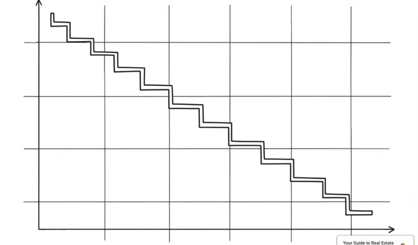
When you first look at a Kaplan Meier curve, it might seem like a staircase going downward. That’s exactly what it is! Each component tells part of the story.
The Y-axis shows survival probability, running from 0 to 1 (or 0% to 100%). Think of this as the chance that something hasn’t experienced the event yet. At the start, everyone begins at 100% – nobody has “failed” or experienced the event.
The X-axis represents time – days, months, years, or whatever unit makes sense for your study. In real estate, this might be “days on market” or “years until a tenant moves out.”
The curve itself is a step function that only changes when something actually happens. Between events, the line stays perfectly flat. This isn’t a smooth curve because survival probability only drops when real events occur.
Those dramatic vertical drops mark when events happen. Each downward step means one or more subjects experienced the event at that exact time. A big drop means many events happened at once, while a small step might represent just one occurrence.
The horizontal lines between drops show survival intervals where nothing happened. These flat segments can be short or stretch for long periods, depending on when events cluster together.
You’ll often see small tick marks or plus signs along the horizontal lines. These mark censored data – subjects we lost track of before their event occurred. Maybe a homeowner withdrew their listing, or a study participant moved away. The Kaplan Meier curve brilliantly uses this partial information instead of throwing it away.
Interpreting the Data
Reading the components is just the beginning. The real insight comes from understanding what the curve’s shape reveals about your data.
The median survival time appears where the curve crosses the 50% line on the Y-axis. This tells you when half your subjects have experienced the event. If you’re tracking homes for sale, a median of 45 days means half will sell within that timeframe.
Mean survival time can be estimated from the area under the curve, though it’s trickier to calculate and more sensitive to outliers than the median.
The curve’s shape reveals patterns in your data. A steep early drop suggests many events happen quickly, while a gradual slope indicates events are spread out over time. Long plateaus show periods where very few events occur.
Steepness of decline matters tremendously. The faster the curve drops, the more rapidly events are occurring. A gentle slope suggests most subjects “survive” for longer periods.
Plateaus indicate stable periods where survival probability stays constant. These might represent natural break points in your data or periods where many observations were censored.
Here’s a crucial warning: be very careful interpreting the tail end of any Kaplan Meier curve. As time progresses, fewer and fewer subjects remain “at risk.” Those final estimates might be based on just a handful of observations, making them much less reliable than the earlier portions of the curve.
Calculating the Estimate
The Kaplan Meier curve uses something called the product-limit estimator. Don’t let the fancy name scare you – the concept is straightforward.
At each time point where an event occurs, we calculate the probability of surviving that specific moment. Then we multiply all these conditional probabilities together to get the overall survival probability.
Here’s how it works step by step. First, we identify every time point where an event happened. Censored observations don’t create new steps, but they do reduce the number of people “at risk” for future calculations.
At each event time, we count the number at risk – everyone who could still experience the event at that moment. This excludes anyone who already had the event or was censored before this time.
We also count the number of events that actually occurred at this specific time point.
The probability of surviving this particular interval equals the number who survived divided by the number at risk: (number at risk – events) ÷ number at risk.
Finally, we multiply this conditional probability by all the previous survival probabilities to get our cumulative survival estimate.
Let’s see this in action with a real estate example:
| Time (Days on Market) | Number at Risk | Events (Sales) | Censored | Survival Probability |
|---|---|---|---|---|
| 0 | 10 | 0 | 0 | 1.00 |
| 15 | 10 | 2 | 0 | 0.80 |
| 30 | 8 | 1 | 1 | 0.70 |
| 45 | 6 | 0 | 2 | 0.70 |
| 60 | 4 | 1 | 0 | 0.525 |
Notice how censored properties reduce the number at risk without triggering a probability drop. This careful handling of incomplete data makes the Kaplan Meier curve incredibly valuable for real-world analysis.
The mathematical formula might remind you of concepts from The Empirical Rule, where we use systematic approaches to understand data patterns and make reliable predictions from incomplete information.
Understanding these calculations helps you appreciate why the Kaplan Meier curve has become such a trusted tool across industries – from medical research to real estate market analysis.
Applications and Group Comparisons
The beauty of the Kaplan Meier curve is that it’s not just a medical tool – it’s incredibly versatile. Once you understand how it works, you’ll start seeing opportunities to use it everywhere, especially in real estate where timing is everything.
Common Uses Across Industries
While Edward L. Kaplan and Paul Meier originally developed their method for medical research in their groundbreaking 1958 paper, smart professionals across industries quickly realized its potential. In medicine, doctors use it to track patient survival rates and treatment effectiveness. Engineers rely on it to predict when machinery will fail, helping them plan maintenance schedules.
Economists have found it particularly useful for studying unemployment duration – essentially asking “how long until someone finds a new job?” Business analysts use Kaplan Meier curves to understand customer behavior, like predicting when subscribers might cancel their services.
The common thread? All these situations involve waiting for something important to happen, and often dealing with incomplete information along the way.
Using the Kaplan-Meier Curve in Real Estate
Here’s where things get exciting for real estate professionals. The Kaplan Meier curve can transform how we understand market dynamics and make decisions.
Time on market analysis is the most obvious application. Instead of just looking at average days on market (which can be misleading), we can create curves that show the probability a property will still be available after 30, 60, or 90 days. This gives sellers realistic expectations and helps agents set better pricing strategies.

This hypothetical curve shows that condos (blue) tend to sell faster than single-family homes (orange) in a given market, with a steeper initial drop in their survival probability (remaining on market).
For investors, understanding investment holding periods becomes crucial. A Kaplan Meier curve can model how long you might hold a property before a profitable sale opportunity arises. This insight directly supports our approach to what is investment planning.
Tenant retention analysis offers another powerful application. Property managers can track how long tenants typically stay, comparing different property types or lease terms. This helps optimize rental strategies and predict income stability.
Even mortgage default rates can be modeled this way, helping lenders assess risk more accurately than traditional methods.
Comparing Two or More Curves
The real magic happens when you compare different groups using Kaplan Meier curves. Are luxury homes really selling faster than starter homes? Is your new marketing strategy actually working?
Visual inspection gives you the first clue. When you plot multiple curves on the same graph, look for clear patterns. If one curve consistently stays above another, that group has higher “survival” probability – meaning events happen more slowly. In real estate terms, if your “premium listing service” curve stays below the “standard service” curve, properties with premium service are selling faster.
But don’t rely on your eyes alone. Statistical tests like the log-rank test tell you whether the differences you’re seeing are real or just random variation. When we run these tests, we’re looking for p-values – typically anything below 0.05 suggests the difference between groups is statistically significant.
Hazard ratios add another layer of insight. Think of this as a comparison of risk levels. A hazard ratio of 1.5 means one group has 50% higher risk of experiencing the event (like selling) compared to the reference group.
This statistical approach helps us make confident decisions rather than guessing. Whether we’re comparing neighborhoods, property types, or marketing strategies, the Kaplan Meier curve provides the clarity we need for success.
Key Considerations: Assumptions and Limitations
Every statistical tool has its strengths and weaknesses, and the Kaplan Meier curve is no exception. Think of it like a reliable car – it’ll get you where you need to go, but you need to understand its limitations and drive it properly to avoid getting stuck on the side of the road.
Understanding these assumptions and limitations isn’t just academic – it’s crucial for making smart decisions with your data, whether you’re analyzing property sales or tenant retention patterns.
Underlying Assumptions of the Kaplan-Meier Curve Method
For your Kaplan Meier curve to give you reliable results, three key assumptions need to hold true. Let’s break these down in plain English:
Non-informative censoring is the big one here. This fancy term simply means that when someone drops out of your study, the reason they left shouldn’t be related to what you’re measuring.
Imagine you’re tracking how long properties stay on the market. If a homeowner pulls their listing because of a family emergency, that’s probably non-informative – the emergency has nothing to do with how marketable the house is. But if they pull it because they’re getting nothing but lowball offers, that’s different. That suggests the house might not sell well anyway, which could skew your results.
Independence of censoring and survival goes hand-in-hand with the first assumption. You don’t want to systematically lose subjects who are about to experience your event. If all the houses that are about to sell suddenly get pulled from your study, your survival estimates will be way off.
Consistent survival probabilities assumes that the underlying conditions stay the same throughout your study period. A property that enters your analysis in January should have the same selling prospects as one that enters in June, assuming all other factors are equal. This also means you’re only tracking one main outcome – in our case, the sale of the property.
Advantages and Limitations
The Kaplan Meier curve became popular for good reasons, but it’s not perfect for every situation.
The biggest advantage is its ability to handle censored data. Before Kaplan and Meier’s 1958 breakthrough, researchers had to throw out incomplete observations. That’s like ignoring half the story! This method lets you use that partial information, giving you a much more complete picture.
Being non-parametric is another huge plus. You don’t need to assume your data follows a specific pattern or distribution. Whether your property sales happen in a predictable pattern or are completely random, the Kaplan Meier curve can handle it. This flexibility makes it incredibly useful across different markets and situations.
The visual representation is intuitive too. Even if you’re not a statistics expert, you can usually look at the step-down graph and understand what’s happening. It’s like having a clear roadmap of your data over time.
However, the method does have some important limitations to keep in mind. It’s a univariable method, which means it can only look at one factor at a time. If you want to understand how property size, location, price, and marketing strategy all affect time on market simultaneously, a basic Kaplan Meier curve won’t cut it. You’d need something more advanced, like a Cox proportional hazards model.
Small sample sizes can be problematic, especially toward the end of your observation period. As fewer properties remain in your analysis, those survival estimates become less reliable. It’s like trying to predict market trends based on just three house sales – not very dependable.
The method also can’t prove causation. Just because luxury homes sell faster than starter homes doesn’t mean the luxury features caused the faster sales. Other factors might be at play, like better marketing budgets or more motivated buyers in that price range.
Common Pitfalls to Avoid
Even with a solid understanding of the method, it’s easy to make mistakes when interpreting results. Here are the most common traps people fall into:
Over-interpreting the tail of the curve is probably the biggest mistake we see. When you’re down to just a few properties at the end of your study period, those estimates become very unreliable. As noted in a practical guide to understanding Kaplan-Meier curves, survival estimates at the far right should be interpreted very cautiously because there are fewer subjects remaining, making the estimates less accurate.
Ignoring censoring patterns is another common error. Those little tick marks on your curve aren’t just decoration – they represent important information about your data quality. If a large chunk of your properties are censored early in the study, it might signal problems with your data collection or underlying assumptions.
Confusing correlation with causation happens all the time. Just because homes with professional staging sell faster doesn’t necessarily mean the staging caused the faster sales. Maybe sellers who invest in staging also have bigger marketing budgets, or they’re more motivated to sell quickly. The staging might just be correlated with these other factors that actually drive the quicker sales.
Misunderstanding what “event” means can lead to confusion too. In medical research, the “event” is often something negative like death. But in real estate analysis, your “event” might be something positive like a successful sale or lease signing. Don’t let the terminology trip you up.
By keeping these considerations in mind, you can use the Kaplan Meier curve effectively to gain real insights from your time-to-event data, whether you’re analyzing market trends or planning your next investment strategy.
Frequently Asked Questions
People often ask us about the Kaplan Meier curve when they’re trying to wrap their heads around this powerful statistical tool. These questions come up time and again, so let’s tackle the most common ones together.
What is the main advantage of using a Kaplan-Meier curve?
The biggest strength of the Kaplan Meier curve is something that might not seem obvious at first: it doesn’t throw away incomplete information.
Think about it this way. You’re tracking how long homes stay on the market in your neighborhood. Some sell quickly, some take months, but others get pulled off the market for various reasons before they sell. Maybe the owner decides to rent instead, or they need to relocate suddenly for work.
Traditional analysis methods would toss out those “incomplete” cases entirely. But the Kaplan Meier curve says, “Wait a minute – we know that house was on the market for at least 45 days before it was withdrawn. That’s valuable information!”
This ability to incorporate censored data provides a much more accurate picture than methods that discard incomplete observations. You’re getting insights from your entire dataset, not just the “perfect” cases that followed through to completion.
Plus, it’s a non-parametric approach, which means it doesn’t force your data into a predetermined pattern. Your real estate market data can be as unique as it wants to be.
What does a “step” down in a Kaplan-Meier curve signify?
Every time you see that characteristic step down in a Kaplan Meier curve, something important just happened – an event occurred at that exact moment in time.
In medical research, that step might represent a patient passing away. In our real estate world, it could mean a property finally sold, a tenant moved out, or an investment was liquidated. The steeper the drop, the more significant the event was relative to the number of cases still being tracked.
Here’s what makes this interesting: the curve stays perfectly flat between these steps. Those horizontal lines aren’t boring – they’re telling you that during those time periods, nothing happened. Properties stayed on the market, tenants stayed put, investments held steady.
The size of each step tells a story too. A big drop means several events happened at once, or the event affected a large portion of the remaining group. A tiny step suggests just one or two cases out of many still being tracked.
Can you compare two Kaplan-Meier curves just by looking at them?
This is where our eyes can play tricks on us. You can glance at two Kaplan Meier curves and get a gut feeling about which group is performing better. Maybe one curve consistently stays higher than the other, or one drops off much faster initially.
But here’s the thing – visual comparison is just your starting point, not your finish line.
Our brains are surprisingly bad at determining whether differences between curves are meaningful or just random noise. Those curves might look different, but the difference could easily be explained by chance alone, especially if your sample sizes are modest.
That’s where the log-rank test comes to the rescue. This statistical test examines the entire survival experience between groups and gives you a p-value. If that p-value is low (typically less than 0.05), you can confidently say there’s a real, meaningful difference between your groups.
So by all means, look at those curves and form your initial impressions. But always back up your observations with proper statistical testing. It’s the difference between making educated guesses and making data-driven decisions in your real estate strategy.
Conclusion: Leveraging Survival Analysis for Smarter Decisions
Throughout our journey together, we’ve finded that the Kaplan Meier curve is far more than just a statistical tool – it’s a powerful lens through which we can view time-to-event data. This non-parametric method has revolutionized how we understand duration and timing, from its groundbreaking beginnings in Edward Kaplan and Paul Meier’s 1958 research to its widespread applications today.
What makes the Kaplan Meier curve truly special is its remarkable ability to make sense of incomplete information. While other methods might throw away valuable data when observations are cut short, this approach accepts those partial stories and weaves them into a more complete picture. It’s like having a conversation where some people leave early – you still learn from what they shared while they were there.
The beauty of this method extends far beyond medical research, where it first made its mark. We’ve seen how it can transform our understanding of real estate markets by tracking time on market analysis, revealing patterns in investment holding periods, and helping us understand tenant retention in ways we never could before. When we can visualize how long properties typically stay on the market or predict mortgage default rates, we’re not just looking at numbers – we’re uncovering the stories behind market behavior.
At Your Guide to Real Estate, we’re passionate about turning complex data into actionable insights that make your real estate journey smoother and more successful. Understanding tools like the Kaplan Meier curve represents our commitment to providing you with a proven framework and stress-free guidance for navigating today’s dynamic real estate market.
The step-down curves we’ve learned to read, the median survival times we’ve calculated, and the group comparisons we’ve explored all serve one ultimate purpose: helping you make smarter, more informed decisions. Whether you’re a first-time buyer wondering about market timing, an investor analyzing potential returns, or someone curious about when to list your property, these data-driven insights can be your competitive advantage.
Ready to put these analytical skills to work in your real estate strategy? Learn more about using data in your strategy with our guide to competitive market analysis in real estate. After all, in real estate as in life, knowledge truly is power – and the Kaplan Meier curve is one more powerful tool in your decision-making toolkit.


")